Example
Overview
The priint:planner Grid planning allows users to assign products to grid page templates in static documents.
We assume the user is already familiar with the Grid Planning, if not check this documentation.
The Dynamic Templating AccPack provides layout conditions and rules for creating priint:comet templates to be used in the Grid Planning view of priint:planner. We aim to provide tools for our users to create dynamic templates that react to resizing and changed dimensions in the priint:planner.
What can be achieved
We are looking at a typical Grid planning of a static document in our priint:planner.
When working the Grid planning we are working based off a special page template we also call grid page template. While the page template that is assigned to the document, defines the grid during the planning we can change these dimensions resulting in the actual size being different.

All of our utilities provided by the AccPack work based of the final dimensions after multiple grid elements have been merged.

For our demo we prefixed the dynamic templates with [dynTemp] to differentiate them.
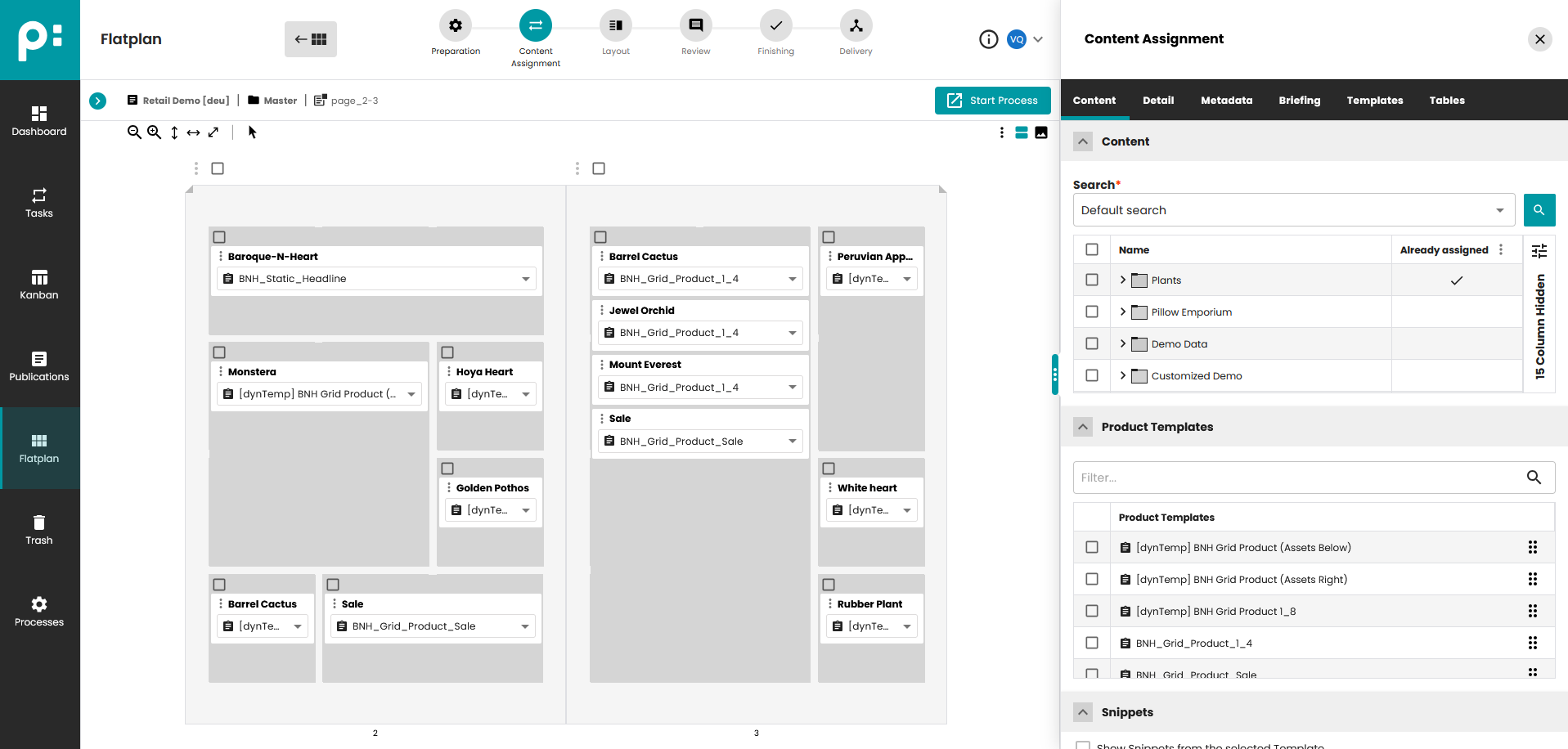
The screenshot shows the content assignment view and shows products with template assignment. You will note that there's both dynamic and regular statically sized templates being assigned.
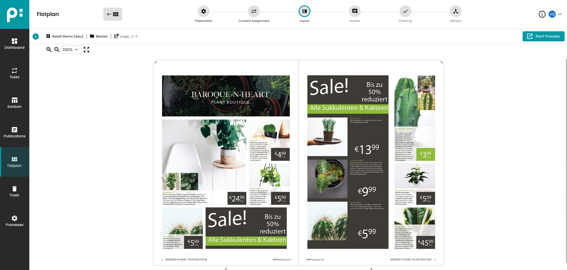
Now switching to the layout view, the priint:suite and the attached rendering service will generate previews for every grid element.
You can see that even though the grid space occupied by the same template is different, in the final output, all space assigned will be used up.
How does it work?
If you want to understand how our AccPack can support you, we need to assume that you are familiar with priint:comet plugin especially the application of layout rules and layout conditions during the template creation.
Let's have a look at the template we used in our example above.
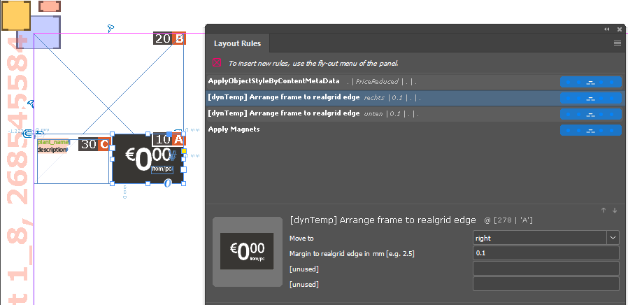
We selected the price button, to show what we assigned: The layout rule [dynTemp] Arrange frame to realgrid edge is assigned twice.
Once with Move to: Right and once with Move to: Bottom.
Find out more about this rule in the reference section.
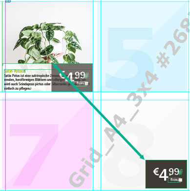
In the final buildup This results in the price button being placed in the bottom right corner based on the dimensions of the merged grid element, not the original grid positions as defined by the page template.
More Examples
Below you will see more examples of our layout rules and conditions in action. Find more information about the individual rules and more rules in the concept and the reference section of this documentation.
Place a subtemplate
We want to provide a way for the user to place optional subtemplates. Use these layout rules, to place a template referenced by ID. Can be combined with layout conditions.

Fit-frame to Edge
Since the space in our template is limited by the grid elements, the default fitframe functionality that will resize the frame so that all content is displayed, can't be used. We provide an alternative that evaluates the actual grid size. Since space is limited, this might result in oversets that needs to be resolved manually.

Move to next frame
Allows placement relative to other frames.

Enlarge to next frame
These rules resize the current frame until it reaches the nearest frame in the same comet group. One rule resizes in a single direction, the other resizes proportionally from a selected anchor point.
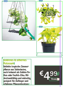
Cascading Area Build
If you have lots of variant images that you are building in an Area build, it is often useful to build them in a cascading way. In manual finishing processes these can be moved to the final position.
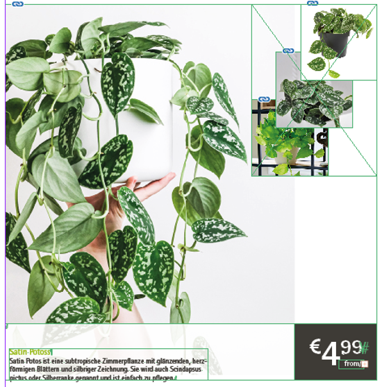
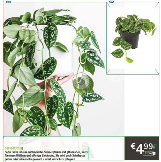
Enlarge the First Repeating Element
Area Build allows placing as many repeating elements as fit in a given space, however when there's only one image you often want to display it more prominently compared to when you have lots of images.
Enlarge First Repeating Element
Next steps
Continue to learn more about the concepts, explaining in more detail how the included rules and conditions work.